

This year, Benjamin Moore’s Color of the Year is Silhouette AF-655, a rich espresso with charcoal undertones. The mix of brown and charcoal has the cozy earthiness of brown tones with the sophistication and flexibility of a neutral gray. It’s essentially the paint-world equivalent of a tailored suit — moody yet versatile, warm yet grounded, and perfect for anyone ready to move beyond beige and bright white.
But Silhouette isn’t just about looking dramatic. Using this color in your home is meant to bring depth and personality that feels timeless and cozy.
Discover the best places to use this hue in your home and how to style it properly!
Best Places to Use Benjamin Moore’s 2026 Color of the Year
Living rooms and cozy corners: If you want a space that feels enveloping and warm, Silhouette will do the trick. Use this color in reading nooks, family rooms, or on a fireplace wall to instantly add drama and depth. Pair it with lighter textiles, soft throws, and brass or wood accents to keep things from feeling overly dark.
Bedrooms and dining rooms: Silhouette can transform bedrooms and dining rooms into sophisticated, calm retreats. Because it’s deep but not pitch-black, it pairs exceptionally well with crisp whites or creamy neutrals. Adding in these lighter shades helps you avoid creating a cave atmosphere, but if that’s your vibe, go for it!
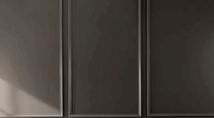
Cabinets, doors, or built-ins: Not ready to commit to painting full walls? Try Silhouette on cabinetry, closet doors, or built-ins. On cabinetry, especially, it adds richness and makes hardware, stone countertops, or natural wood stand out.
Tips for Styling Silhouette
When you’re updating your home’s color palette, choosing the actual color is only half the battle. You also have to know how to style it so everything remains cohesive.
- Contrast is key. Because Silhouette is dark and dramatic, surrounding it with lighter elements like creamy whites, soft linen curtains, or light wood floors helps open up the space, says an interior designer in Annapolis, MD.
- Use texture. Mix in cozy fabrics, woven rugs, wood furniture, or velvet upholstery to add dimension and keep the look balanced.
- Let metal and wood details pop. Brass fixtures, warm-toned wood furniture, or marble/stone surfaces look especially elegant against this backdrop.
- Mind the light. Silhouette changes subtly depending on natural vs. artificial light. Test a large swatch on your wall and check it at different times of day before doing the whole room.
Pairing Colors: The 2026 Palette
The Color of the Year isn’t meant to stand alone. It comes from a curated palette of colors chosen to complement it beautifully. Benjamin Moore recommends pairing Silhouette with soft, creamy neutrals like Swiss Coffee OC‑45, a gentle blush-rose like First Crush CSP‑310, and earthy greens like Narragansett Green HC‑157.
If none of these color pairings are doing it for you, Silhouette also plays nicely with:
- Light, airy neutrals on trim or ceilings for contrast
- Soft blushes for a touch of warmth and femininity
- Deep greens or muted terracotta for a natural, grounded palette
Are you ready for a paint update that feels grown-up yet cozy, dramatic yet timeless? Benjamin Moore’s Color of the Year 2026 might just be what you need. Use these tips to incorporate this rich color into your home in the new year.
