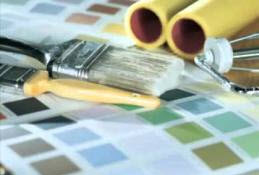
Like fashion, home decor trends change in the blink of an eye. One day a color is in and the next, it’s out. The use of gray and other neutral color schemes have become very popular in recent times – it’s easy to work a multitude of colors, designs, and styles into a neutral backdrop. Other colors, though they’re still used, have become dated and passé. If you’re considering a home remodel, keep these outdated shades in mind and off of your walls.
White on white. White is still a popular color in home design – the ways in which it’s used are what have become outdated. Many people consider white as a neutral, and if it’s used as a wall color, that leaves plenty of room to play with pops of colorful accessories. Similarly, white walls are perfect for pairing with accent walls. Conversely, the use of white walls with white accessories and furnishings is a trend of the past. This 80’s trend has almost completely disappeared, mostly due to the fact that it’s so hard to keep anything white clean! In addition, too much white in a space can make a room feel sterile or fall flat.
Neon Shades. If you’ve ever considered using neon shades for a media room or a child’s bedroom, think again! These colors can make people feel ill or induce headaches. There is no comfort in neon. If neon shades are a must-have, find fun ways to use them in your accessories. Incorporate neon-printed throw pillows or wall art.
Chocolate Brown. Rich hues like chocolate brown can make a space feel smaller than it actually is. While brown can be considered a neutral color, consider what shade of brown you are going to use. Lighter shades, like tan, connect more with homeowners and work particularly well if you’re going to put your home on the market. Neutral, warm shades make a home more visually appealing and make it easier for potential buyers to visualize themselves in the space.
Orange. Unless it’s a hue of coral or peach, orange is a no-go wall color. Terracotta is especially unfavorable in any room of the household. Orange is said to be one of the least-liked colors but if you are one of the few that does enjoy the color, include it like you would a neon – in accessories.
Bright Yellow. Yellow is a happy color – one that you might think would bring feelings positive vibes to a space. While it is a stimulating color, the feelings it can stimulate are those of frustration and anger. That’s why this color is being seen less and less in homes. Certain shades of muted yellows work in small spaces like kitchens and bathrooms, but as for the rest of the home, this color is best used as an accent.
Choose your paint colors carefully! Avoid choosing colors that are trendy, as they can make you home feel more like a museum and decrease the resale value. Avoid these passé colors and instead, opt for classic shades that stand the test of time instead. For more help choosing colors for your home, reach out to the experts at CertaPro Painters of North Charlotte.


